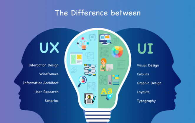
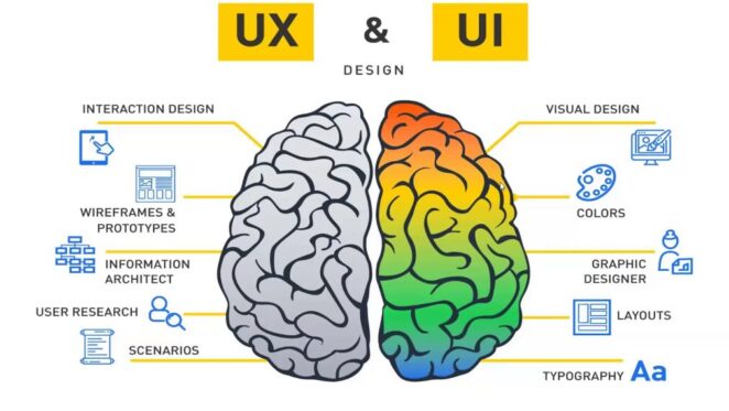
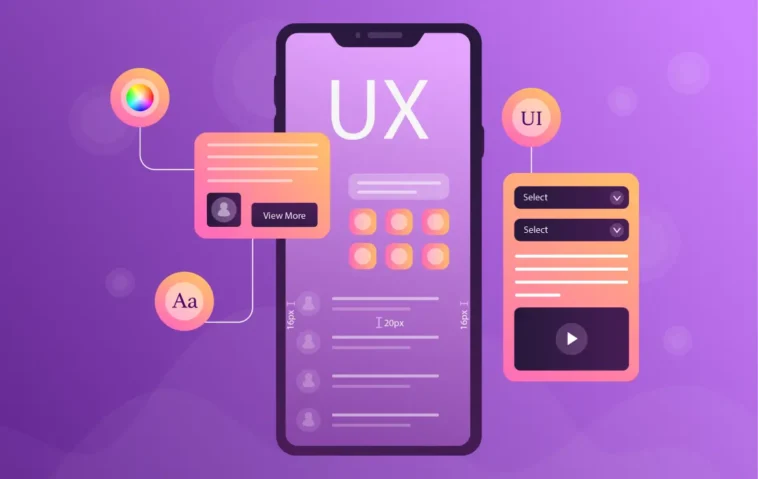
In the realm of user experience (UX) and user interface (UI) design, inclusivity is not just a buzzword; it’s a fundamental principle that shapes the way we create digital experiences. In this exploration of inclusive practices in UX/UI design, we delve into the strategies and considerations that empower designers to create experiences that leave no user behind.
Understanding Accessibility in UX/UI Design
Accessibility is the practice of making digital products and platforms usable by people with varying abilities. It’s about breaking down barriers and ensuring that everyone can navigate, interact, and derive value from digital experiences. When accessibility is at the forefront of design, it benefits not only individuals with disabilities but also enhances the overall user experience for everyone. At Outcrowd branding agency (https://www.outcrowd.io/development-page), we recognize the pivotal role of accessibility in design, ensuring that every user, regardless of abilities, can engage seamlessly with digital interfaces.

Color Contrast and Readability: High color contrast between text and background enhances readability for users with visual impairments. Designers must ensure that text is legible and stands out, even for those with color vision deficiencies.
Typography and Font Choices: Selecting clear and easy-to-read fonts benefits all users, including those with dyslexia. Proper spacing and line height contribute to a more comfortable reading experience.
Navigational Clarity: Intuitive navigation is essential. Clear labels, headings, and menu structures assist screen readers and users navigating through keyboard commands.
Designing for Screen Readers
Alt Text for Images: Providing descriptive alt text for images ensures that visually impaired users understand the content and context. Alt text should be concise, informative, and convey the purpose of the image.
Semantic HTML: Using semantic HTML elements (like headings, lists, and landmarks) assists screen readers in understanding the content’s structure and hierarchy.
User-Friendly Forms and Interactions
Form Labels and Input Fields: Clearly labeled form fields with associated labels help all users understand what information is required. This is particularly important for users relying on screen readers.
Focus States and Keyboard Navigation: Design focus states for interactive elements, ensuring that users can navigate through a keyboard or other assistive devices. Visible focus indicators prevent confusion and improve usability.
Multimedia and Video Content

Closed Captions and Subtitles: Including closed captions and subtitles for video content benefits not only deaf and hard-of-hearing users but also those who prefer muted environments or non-native speakers.
Transcripts: Providing transcripts for audio and video content ensures that users who cannot access multimedia content can still access the information.
Mobile and Responsive Design
In the digital age, where users interact with content across a myriad of devices, mobile and responsive design have become paramount in creating inclusive and user-centric experiences. Mobile devices, with their varying screen sizes and touch interactions, demand a design approach that ensures usability and accessibility for all users, regardless of the device they’re using.
Touch Targets and User-Friendly Interactions
Optimal Touch Targets: Designing touch targets that are large enough to be easily tapped, even by users with limited dexterity, is crucial. Adequate spacing between interactive elements prevents accidental touches and enhances user control.
Gesture Consideration: Mobile interfaces often rely on gestures like swiping and pinching. Ensuring that these gestures are intuitive and widely understood improves the usability of the interface for users with diverse abilities.
Viewport Adaptation and Responsive Layouts

Fluid Grids: Implementing fluid grids ensures that your design elements adjust proportionally to the user’s screen size. This prevents content from becoming cramped or overly spaced, regardless of the device being used.
Media Queries: Leveraging media queries allows you to apply different styles based on the device’s screen size and orientation. This tailors the experience to the user’s context, providing an optimal viewing experience.
Content Prioritization: In responsive design, prioritize essential content for smaller screens while preserving the overall user journey. This prevents information overload and ensures a focused and engaging experience.
Cross-Device Consistency
Unified Branding: Ensure that your brand’s visual identity remains consistent across different devices. Colors, fonts, and imagery should align, reinforcing brand recognition.
Content Parity: Strive for content parity across devices, ensuring that users have access to the same information and functionalities regardless of the screen size they’re using.
Adaptive Images and Performance Optimization
Image Optimization: Implement techniques like responsive images and lazy loading to ensure that images are appropriately sized and load quickly, enhancing the overall user experience.
Performance Considerations: Mobile devices often have limitations in processing power and network connectivity. Optimizing performance by minimizing code and reducing the number of HTTP requests ensures a smooth and efficient experience.
Testing and User Feedback: Refining Accessibility and Usability

Incorporating accessibility and usability testing, along with gathering user feedback, is a vital step in ensuring that your mobile and responsive design truly meets the needs of diverse users.
Accessibility Testing
Screen Reader Testing: Test your mobile interface with screen readers to ensure that users with visual impairments can navigate and understand the content effectively.
Keyboard Navigation: Verify that all interactive elements are navigable and usable through keyboard commands, catering to users who rely on keyboard navigation.
User Testing with Diverse Audiences
Diverse User Profiles: Involve users with varying abilities, demographics, and devices in your testing process. This provides insights into how different users interact with your mobile design.
Usability Feedback: Gather feedback on the usability, efficiency, and overall satisfaction of the mobile experience. User insights can uncover potential pain points and areas for improvement.
Iterative Design and Continuous Improvement
Implement Feedback: Incorporate user feedback into your design iterations. Address identified issues and optimize the mobile experience based on real-world usage.
Regular Testing: Mobile and responsive design is an ongoing process. Regularly test and refine your design to ensure it remains adaptable to evolving user needs and technological advancements.
Conclusion: Inclusive Experiences for All
In the dynamic landscape of UX/UI design, accessibility is a cornerstone that underpins exceptional user experiences. At Outcrowd branding agency, we champion inclusive practices that ensure digital interfaces are welcoming, intuitive, and empowering for every user. By implementing strategies such as color contrast optimization, screen reader compatibility, user-friendly forms, and responsive design, designers can create inclusive digital landscapes where every user’s journey is considered and catered to.
In embracing accessibility, designers contribute to a more inclusive and equitable digital world, one where technology is a tool that bridges gaps and empowers individuals of all abilities to engage, connect, and thrive. As we champion the ethos of inclusive design, we pave the way for a future where technology serves as a catalyst for unity and empowerment.


